Users were leaving in the first week.

Users were leaving in the first week.

The Rounds had a retention problem. I traced it to confusion in their checkout and subscription flows, then rebuilt both around clarity.

The Rounds had a retention problem. I traced it to confusion in their checkout and subscription flows, then rebuilt both around clarity.

PRODUCT

PRODUCT

Grocery delivery service

Grocery delivery service

ROLE

ROLE

UX designer

UX designer

TYPE

TYPE

Sponsored project

Sponsored project

Contributors

Contributors

CE, QL, SL

CE, QL, SL

HOW IT WORKS

Subscribe to items individually

Locally sourced, sustainably packed/shipped

Recycle jars to close the ecosystem

PROBLEM

Users dropped after week one.

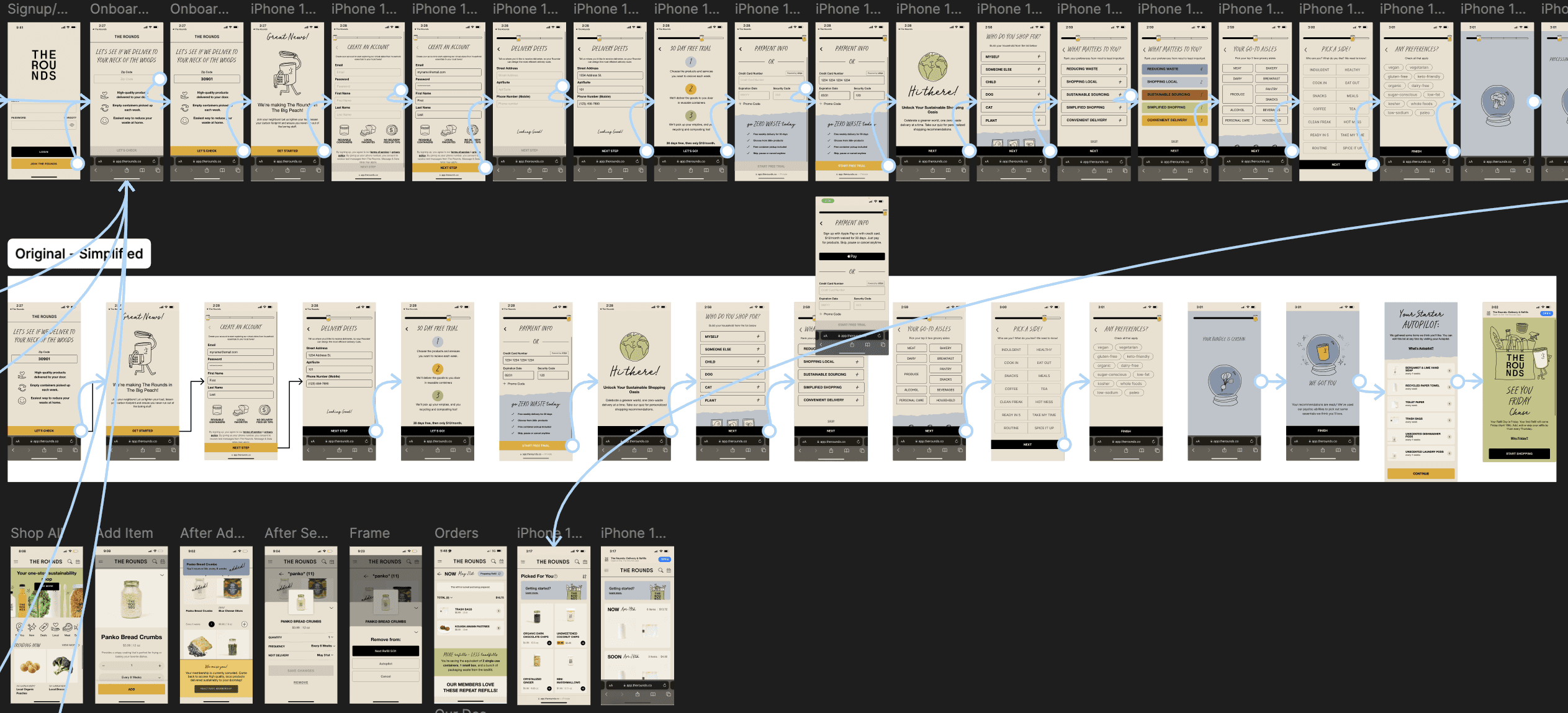
So I built a prototype and tested their entire product experience to figure out why.

DESK RESEARCH

PROTOTYPE

TEST

DISTILL

Reviewing forums, and using competitor services.

This helped me quickly familiarize myself with the product and space.

Prototyping the existing experience to prep for testing.

I rebuilt the ordering and subscription flows in 2 days so we could start testing as soon as possible.

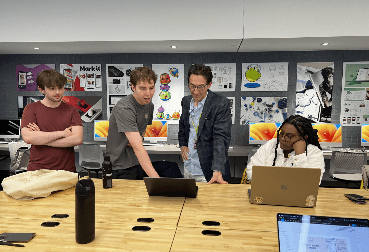
Testing the entire product experience to find the cause of churn.

We had 7 participants…

Look at common marketing

Signup + Onboard

Find and order specific items

Edit/verify their order

Physically receive their order

4/7 struggled to understand how the product actually worked, unknowingly ordering $70+ of things they didn't want.

"I didn’t even know I had ordered anything."

Users weren’t frustrated by missing products, they were confused by the system. They didn't understand the difference between orders and subscriptions and it wasn't their fault.

4/7 new users accidentally ordered $70+ on their first delivery.

“Where’s my cart? Confusion between orders vs. subscription

Visual hierarchy and brand consistency issues deepened confusion.

Users felt lost in the flow: “I feel like I’m in a maze.”

CONFLICT

Trying new products felt too risky.

Committing to a subscription before trying a product meant deciding frequency without knowing if you'd like it. Users faced decision fatigue, accidental orders, or canceling their entire subscription if they made a mistake.

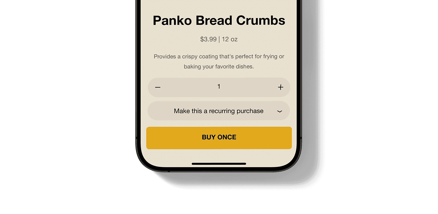
"So what if they could buy once?"

A no-commitment first purchase removes friction and risk. You try it, you know what you like, then decide if it's worth subscribing.

I pitched it to the
Chief of Product. He pushed back.

His point was solid: subscription is The Rounds' identity. Eliminating it entirely would sacrifice their edge.

I tried meeting them in the middle.

I designed a flow where the subscription only started after the second order, giving users space to try things while remaining subscription-forward.

1.

FIRST PURCHASE

1.
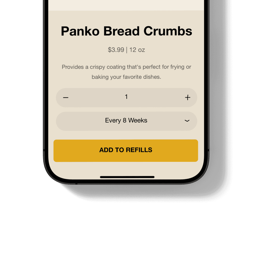
2.

NEXT PURCHASE

2.

Ultimately, leadership rejected it. The business model required subscriptions.

If I couldn't change the business model, I had to focus on the mental model.

The architecture created blind spots.

Vague terms like 'Autopilot' disguised spending as settings. I simplified the terminology and bridged the two, so users could see exactly how their subscription impacted their weekly bill.
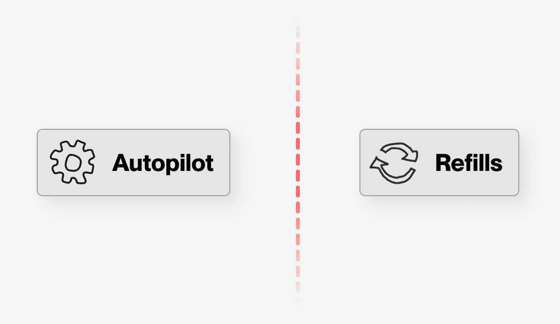
SILOED & AMBIGUOUS
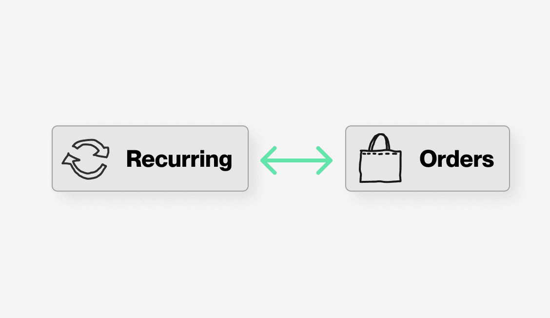
CONNECTED & CLEAR

SOLUTIONS

Clarity wins trust, and trust wins loyalty.

These four other changes went live. Each removed a layer of confusion from checkout and subscription management without changing the business model.

(4/4)

Onboarding Subscriptions

4/7 new users unknowningly ordered $70+ in their first delivery. These items were added during onboarding.

The tooltip was also broken.

I made the post-onboarding subscription more clear, and empowered users to remove items before continuing.

BEFORE

AFTER

(1/4)

Navigation

"I feel like I'm in a maze."

"Where's my cart?"

Users felt annoyed, frustrated, and confused when navigating the mobile app.

I reduced the original 25 nav items to 16, improving decision making in alignment with Hick's law.

BEFORE

AFTER

(2/4)

Shop all

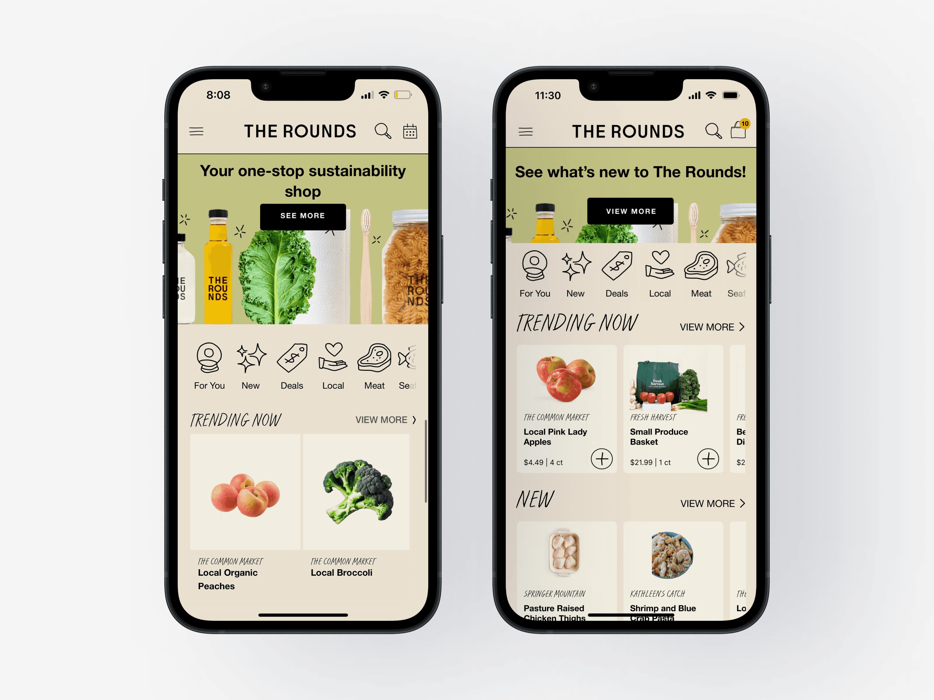
Users struggled to shop using product categories, preferring clear, condensed, ordered information.

I reduced product card size to allow for peaking, encouraging browsing and exploration.

BEFORE

AFTER

Compromise breeds excellent work.

The rejected concept taught me more than any approved design. Respecting constraints and working closely with stakeholders always results in better solutions.

The system became more usable.

SUS scores jumped from 27 to 79.

Users understood the service better.

Comprehension improved 1.5x.

Users rated the service significantly higher.

Sentiment doubled after redesign.

Users completed checkout faster.

Task time dropped from 45m to 15m.

Onboarding Subscriptions

4/7 new users unknowningly ordered $70+ in their first delivery. These items were added during onboarding.

The tooltip was also broken.

I made the post-onboarding subscription more clear, and empowered users to remove items before continuing.

BEFORE

AFTER

BEFORE

AFTER

BEFORE

AFTER

Navigation

"I feel like I'm in a maze."

"Where's my cart?"

Users felt annoyed, frustrated, and confused when navigating the mobile app.

I reduced the original 25 nav items to 16, improving decision making in alignment with Hick's law.

BEFORE

AFTER

BEFORE

AFTER

BEFORE

AFTER

Shop all

Users struggled to shop using product categories, preferring clear, condensed, ordered information.

I reduced product card size to allow for peaking, encouraging browsing and exploration.

BEFORE

AFTER

BEFORE

AFTER

BEFORE

AFTER

Ordering Products

4/7 new users unknowningly ordered $70+ in their first delivery, in part due to ordering confusion.

Designed to be consistent.

Leaving users in the drawer after ordering an item improves transparency.

BEFORE

AFTER

BEFORE

AFTER

BEFORE

AFTER